
 Back
BackDrop Down Menu
Suggested topics:
MenuDrawing mode
Margins
DropDownMenu replaces Menu. You can associate a DropDownMenu with any control, and a right mouse click automatically displays the shortcut menu.
 Note:
Note:
This control is new in the .NET Framework version 2.0.
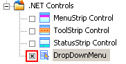
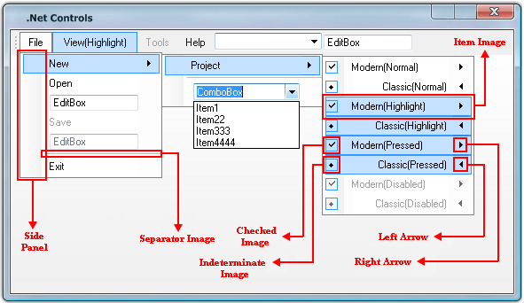
You should start DropDown Menu skin building by checking the appropriate checkbox in "Default Controls" pane.
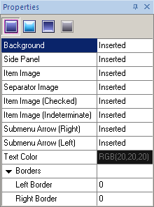
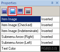
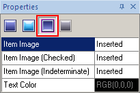
Then you should note that SkinBuilder supports Normal, Highlighted, Pressed and Disabled states for DropDown Menu control which should be customized in Properties pane. Properties list is different for Normal and Pressed states but similar for Highlighted and Disabled states. See it on the pictures below:
 |
 |
 |
Normal State |
Highlighted & Disabled States |
Pressed State |
Despite of the seeming complexity the skinning process consists of three simple steps. All you have to do is to prepare the appropriate images in advance and start skinning.
 Import your pre-created images corresponding to the different Control states in assigned fields by clicking "Browse" button (
 ) and selecting images in "Select file" window.
Image handling implies Margins values setting and Drawing mode assignment.
) and selecting images in "Select file" window.
Image handling implies Margins values setting and Drawing mode assignment.
Specify "Text Color" taking advantage of built-in color palette or choose "Custom Color" as an alternative for the color selection.
Define (Left/ Right) Borders values that allow you to specify the size of a client area frame.
Note:
The DropDown Menu preview in SkinBuilder is not a DropDown Menu control. It's just a model giving a general idea of the skinned control appearance. So the result of the DropDown Menu control skinning depends on your imagination.