
 Back
BackButton
Suggested topics:
Control statesDrawing mode
Margins
Button is one of a GUI's components in the form of a small circle or rectangle with button name on it used for performing an action.
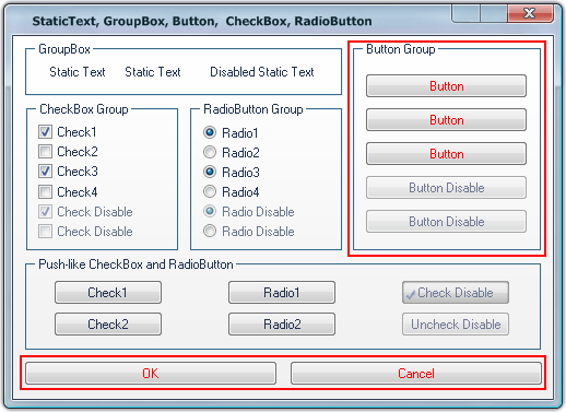
Your task is to change button appearance taking advantage of SkinBuilder functionality provided by the following settings in "Properties pane" assigned for each button state:
- Image
- Text color
Highlight and Pressed states contain the additional Text Offset field:
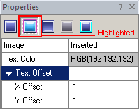
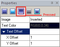
"Text Offset" (X Offset/Y Offset) is a position of button text in layout relative to the default position of text where X offset determines distance from the left and Y offset determines distance from the top for Highlighted state; X being distance from the right and Y being distance from the bottom for Pressed state.
Now let's accomplish skinning of the button control using images prepared in advance:
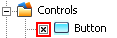
 Click on the check box in front of "Button" control in "Default Controls" pane.
Choose the "Normal" state in "Properties pane" and select an image clicking "Browse" ( ).
).
Set Margins values and Drawing mode in "Options pane".
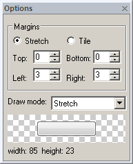
Select a text color in "Text Color" palette.
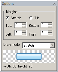
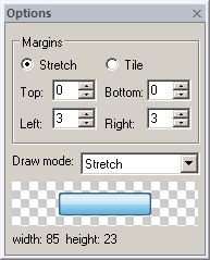
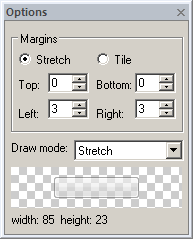
Repeat described procedures for the rest of Button states ("Highlighted", "Pressed", "Disabled" and "Focused"). By the way, you can view how the button changes in these states:
|
 |
a) Normal State |
b) Highlight State |
 |
 |
c) Pressed State |
d) Disabled State |
 Note:
Note:
Buttons might be quite small and pretty big in the same application; this fact requires careful image selection for it to be correctly displayed in spite of the size.