
 Back
BackDatetime Picker
The Datetime Picker control provides a simple interface to exchange date and time information with a user. This interface contains fields, each of which displays a part of the date and time information stored in the control. The user can change the information stored in the control by changing the content of the string in a given field. The user can move from field to field using the mouse or the keyboard.
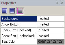
You need to import appropriate graphics corresponding to the different Control states. SkinBuilder supports Normal, Pressed and Disabled states for the Datetime Picker control which should be customized in Properties pane.
 |
 |
Normal |
Disabled |
As for Pressed state, it contains only Arrow Button field, so there is no need to examine it thoroughly.
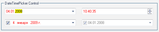
The result of the Datetime Picker control skinning depends on your imagination. As for our example, we've got the following outcome:
Starting Datetime Picker skinning with Normal state will make the rest states skinning easier.
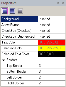
 Insert your pre-created images in the Background, Arrow Button, Check Box (Checked), Check Box (Unchecked) fields by clicking "Browse" button (
 ) and selecting images in "Select file" window. Image handling implies Margins values setting and Drawing mode (Stretch/Tile) assignment.
Specify "Text Color", "Selection Color", and "Selected Text Color" properties taking advantage of built-in color palette or choose "Custom Color" as an alternative for the color selection.
Define (Top/ Bottom/ Left/ Right) Borders values that allow you to specify the boundaries of a client area.
 Note:
Note:
Remember that the skinning process of Datetime Picker will stay invisible unless you check "Datetime Picker" checkbox in "Default Controls".