
 Back
BackHeader
Header is usually used with a List control, but also can be a separate control. Each header item behaves just like a Button, so the settings are pretty the same: Image and Text Color per a state.
Highlighted and Pressed states contain the additional Text Offset field:
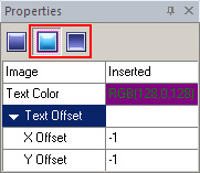
"Text Offset" (X Offset/Y Offset) is a position of Header text in layout relative to the default position of text where X offset determines distance from the left and Y offset determines distance from the top for Highlighted state; X being distance from the right and Y being distance from the bottom for Pressed state.
You need to have some graphics you want to use for your header component skinning for displaying it better.
 - the skinned Header component
 - the standard Header's look (without skinning)
Header skinning is rather simple. It consists of tree procedures fulfilled in Properties pane
1. Image customization.
2. Text Color handling
3. Text Offset specifying
Remarks:
 All of these properties modifications might be as well to require. The first functionality gives you a way to change your header visual look. Drawing mode determination brings image and control sizes in compliance.
The second procedure gives an opportunity to select Text color you need. It is rather self-explanatory.
The third procedure is for specifying a position of Header text in layout.