
 Back
BackMenuStrip
Suggested topics:
MenubarDrawing mode
Margins
MenuStrip is the top-level container that supersedes Menubar. It also provides key handling and multiple document interface (MDI) features.
 Note:
Note:
This control is new in the .NET Framework version 2.0.
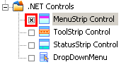
When you start skinning Menu Strip component, check the checkbox in front of "MenuStrip Control" item presented in "Default Controls" pane.
Then switching to "Properties pane" the following attributes for "Normal" state should be customized to change the visual appearance of Menu Strip as you desire.
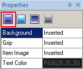
Normal State
To start Menu Strip component skinning you need to import the appropriate graphics corresponding to the different Control states (Normal/Highlighted/Pressed/Disabled). Three last states contain only two fields that you can see on the following picture:
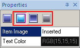
Highlighted/Pressed/Disabled States
The skinning process consists only of two steps:
 Insert your pre-created images in assigned fields by clicking "Browse" button (
 ) and selecting images in "Select file" window.
"Text Color" attribute is intended for color customization by means of built-in palette "Color" or choosing a "Custom Color".
As for our example, we've got the following picture:
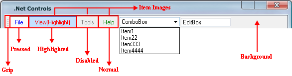
Note:
The Menu Strip preview in SkinBuilder is not a MenuStrip control. It's just a model giving a general idea of the skinned control appearance. So the result of the Menu Strip control skinning depends on your imagination.