
 Back
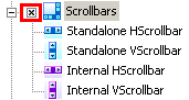
BackScrollbars
Changing scrollbars appearance is carried out with visual modifications and by means of appropriate pre-built images.
SkinBuilder supports skinning of Internal and Stand-along types of Scrollbars. It allows you to create customized Horizontal and Vertical scrollbars for each type.Stand-along Scrollbar is considered to be a separate control type whereas Internal Scrollbar is usually included as a part in other controls e.g. in ListBox, ListControl, TreeControl etc.
Scrollbar is made up of several individual images handling in "Properties pane"for each specific Control state. . Scrollbars support Normal, Highlight, Pressed and Disabled states.
Scrollbars consist of several parts:
• Background
• Thumb
• Arrows
The additional properties for Internal Horizontal Scrollbar are Scrollbar Height and Arrow Width. As for Internal Vertical Scrollbar, it contains the supplementary properties such as Scrollbar Width and Arrow Height. These properties are available only for Normal state.
 Note:
Note:
"Default Controls" pane has a checkbox for both Vertical and Horizontal scrollbars types. Thus it's possible to include/exclude all scrollbars into/from skinning at once.
Let's start Internal Horizontal Scrollbar skinning as an example being guided by the following steps:
 Import pre-built graphics in the Background field of "Properties pane" for "Normal" and "Disabled" states.
Insert the appropriate images for Horizontal Thumb in corresponding field for all provided states.
Repeat the same for the Left and Right Arrows by handling images for arrows.
Specify Scrollbar Height and Arrow Width properties values for "Normal" state.
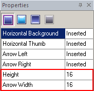
For our example the result should be the following:

Note:
You can specify Height and Width sizes for Scrollbar parts only for Internal Vertical and Internal Horizontal Scrollbars.
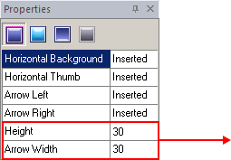
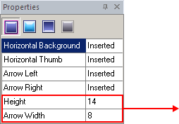
As you can see on our picture above the Scrollbar and Arrow sizes are equal to 16 by default. Changing these values you can modify Scrollbar control appearance.
Compare two examples:
1. 

2. 

Once you have done all that, you have to complete assembling of the Vertical Scrollbar. To adjust the assembling of the Vertical Scrollbar repeat the steps described above attaching the appropriate graphics.

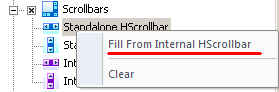
1. If you complete skinning of one Scrollbar type you can significantly save your time with the automatic filling of all properties for all the rest Scrollbars types. According to our example we finished Internal HScrollbar skinning.
Click mouse right button on Stand-along HScrollbar control and choose "Fill from Internal HScrollbar" option. Thus all Internal HScrollbar properties will be duplicated to Stand-along HScrollbar. With this function of automatic properties filling you can skin other Scrollbars just in one click.
2. Remember that Margins and Drawing mode can be assigned for all inserted images.