Back
BackSlider control
Slider component can be easily customized with simple SkinBuilder tools and graphics prepared beforehand.
 Note:
Note:
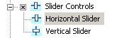
Don't forget to check the appropriate checkbox and the "+" sign clicked in front of "Slider Controls" item in "Default Controls".
A slider skin consists of four images in "Normal" state (see also "Control states") and of three images in all the rest 4 control states: Highlighted, Pressed, Disabled, Focused.
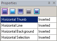
The following attributes are available for skinning in"Properties pane":
- Thumb - a slider handle
- Line – a slider tray
- Background - an image to fill a background of the control, leave it empty if you want to use a dialog form background
- Selection – a part of the selected tray that enables you to manipulate with selected fragment. Usually this property is appropriate in music and video editors
Note:
For the most part tray remains the same, and it is a good case to use "Fill all states" option, just set a proper image for any state, select it and press Ctrl+W (or select "Fill all states" from Edit menu).
As we've just seen, in order to skin a Slider component we can assign new graphics to its skin properties. Apparently, all you have to do is to import pre-built graphics in "Properties pane".
You need to specify Margins and Drawing mode available in "Options pane" for all imported images.
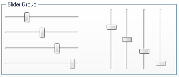
See what you should get after skinning completion: