
 Back
BackStatus Strip
StatusStrip is a combined control which is usually displayed at the bottom of a window, in which an application can display various kinds of status information.
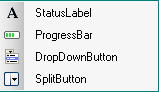
StatusStrip control has no limits on quantity and is consists of:
-StatusLabel |
 |
 Note:
Note:
This control is new in the .NET Framework version 2.0.
Skin creation process
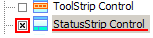
When you start skinning StatusStrip control, check the checkbox in front of "StatusStrip" item presented in "Default Controls" pane.
Note:
StatusStrip preview in SkinBuilder isn't a StatusStrip control. Here StatusStrip is a model giving a general idea of the skinned control appearance.
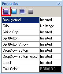
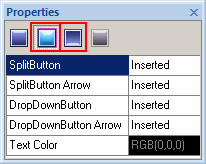
Then you need to import appropriate graphics corresponding to the different Control states. SkinBuilder supports Normal, Pressed, Highlighted and Disabled states for the StatusStrip control which should be customized in Properties pane.
 |
 |
 |
Normal State |
Pressed and Highlighted |
Disabled |
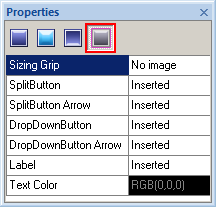
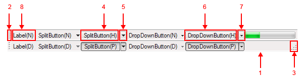
"Properties pane" where you actually change the attributes for each Control states contains Background (1), Grip(2), Sizing Grip(3), SplitButton(4) and SplitButton Arrow(5), DropDownButton(6), DropDownButton Arrow(7), and the Label(8) properties.
To import pre-created graphics to the appropriate fields click on "Browse" button ( ) and select a necessary image in "Select file" window. Margins and Drawing mode modification is available for all inserted images too.

In case you use the image with text for skinning your StatusStrip component you can adjust "Text Color" option in Properties pane by means of built-in palette "Color" or choosing a "Custom Color".

Note:
Be careful to customize all supported control states. At this StatusStrip model properties are shown by N, H, P, D letters:
(N) - Normal
(H) - Highlighted
(P) - Pressed
(D) - Disabled.