
 Back
BackTab control
Suggested topics:
Control statesDrawing mode
Margins
Button
You can use the following guidance to create your own skin for Tab Control the same way we use SkinBuilder and specific graphics for Tab control skinning.
We begin Tab Control skinning with selecting the element in "Default Controls" pane which has tree-view structure. You should see the following picture in "Default Controls":
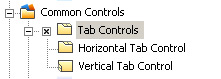
Having the appropriate checkbox checked and the "+" sign clicked in "Default Controls" pane let's turn to attributes alignment provided in "Properties pane".
Follow our instructions:
 Select "Horizontal Tab Control" item and notice that "Tabs" window appears in Preview area. After that SkinBuilder activates "Properties pane" with all items available for settings handling.
Customize all attributes in "Normal" state (Highlighted/Pressed/Disabled/Focused states are also supported) for the Horizontal Tab Control shown in "Properties pane":
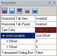
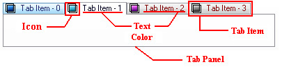
1. Tab Item
2. Tab Panel property is considered to skin unique background for internal content.
3. Text Color
4. Icon Location
a. Standard - locate an icon by default
b. Use Offset (X Offset/Y Offset) - position of icon in layout, X offset determines distance from the left and Y offset determines distance from the top.
5. Transparent Dialog Box - makes Dialog background transparent in the Tab Control.
a. True
b. False
 Notes:
Tab Item and Tab Panel attributes require images insertion to customize control's visual appearance that can be also edited by means of Drawing mode and Margins.
Define "Text Color" property taking advantage of built-in palette or choose "Custom Color" as an alternative. Remarks:
Tab Item and Text Color attributes are available to change in all the rest Control states.
Highlighted and Pressed states contain the additional Text Offset field.
"Text Offset" (X Offset/Y Offset) is a position of tab text in layout where X offset determines distance from the left and Y offset determines distance from the top for both states.
Vertical Tab Control can be skinned in the same manner as Horizontal Tab Control.